
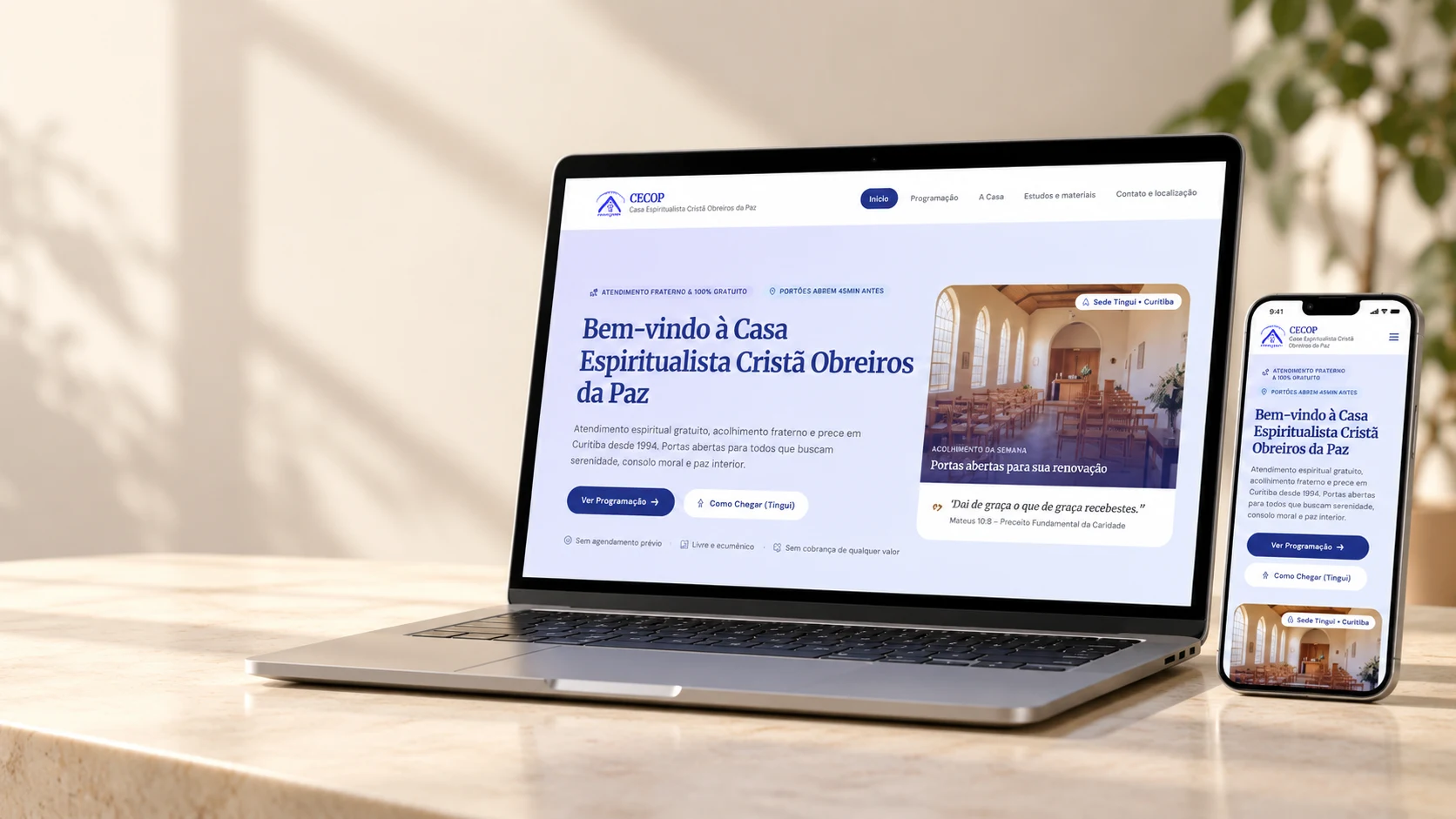
INDEPENDENT VOLUNTEER PROPOSAL · AI-ASSISTED
Clarity for visitors. Autonomy for volunteers.
CECOP — redesigning a community institution’s website, from content organization to a working CMS.
Guidance is part of the welcome
A first visit starts with practical questions: when can I attend, is it free, how should I prepare, and where is it? The previous site distributed these answers across navigation items, notices and pages with uneven amounts of content.
I reviewed the existing public content and developed an independent volunteer proposal. This project did not include user interviews, formal usability testing or team alignment workshops.
Designing for maintenance
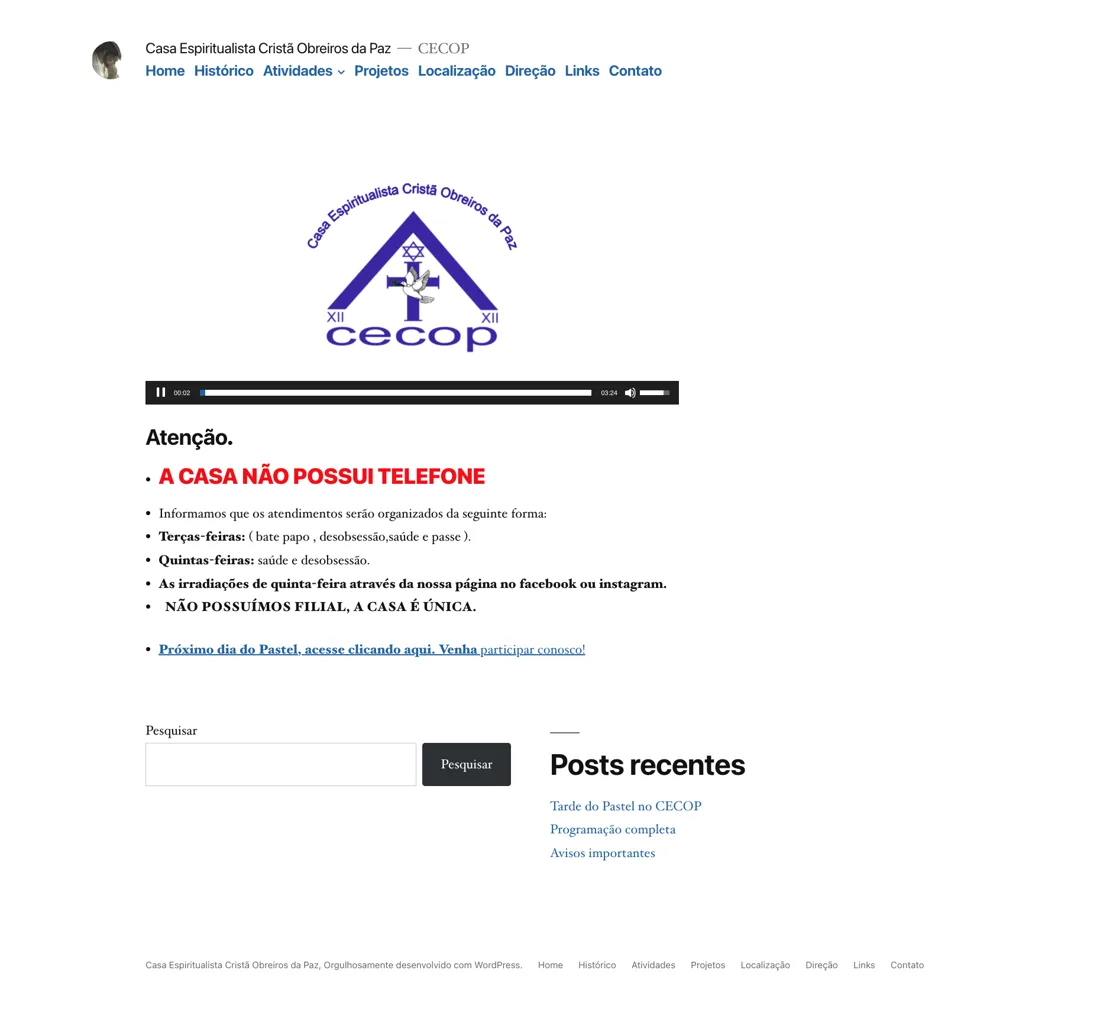
The challenge had two sides: help visitors find useful information and let volunteers keep it current. I handled content organization, visual direction, interface design, implementation and CMS integration, with AI support.
Consolidate content
Five destinations instead of reproducing every legacy menu item.
Separate content from layout
Structured editing fields preserve presentation while allowing changes to text, schedules and notices.
Keep the delivery lightweight
Static pages and Git history suit an informational site. The trade-off is that publication depends on authentication, repository access and a successful build.
Reorganize before redesigning
I grouped related information into Home, Schedule, About, Study materials, and Contact & location. Contact and directions support the same visit-planning task; existing books were preserved, while the recurring fundraising event received editable content.
- Início
- Programação
- A Casa
- Estudos e materiais
- Contato e localização
Before and after
The comparison focuses on hierarchy and content organization. These are real screenshots, not evidence of measured usability gains. Open any image to inspect the complete capture.
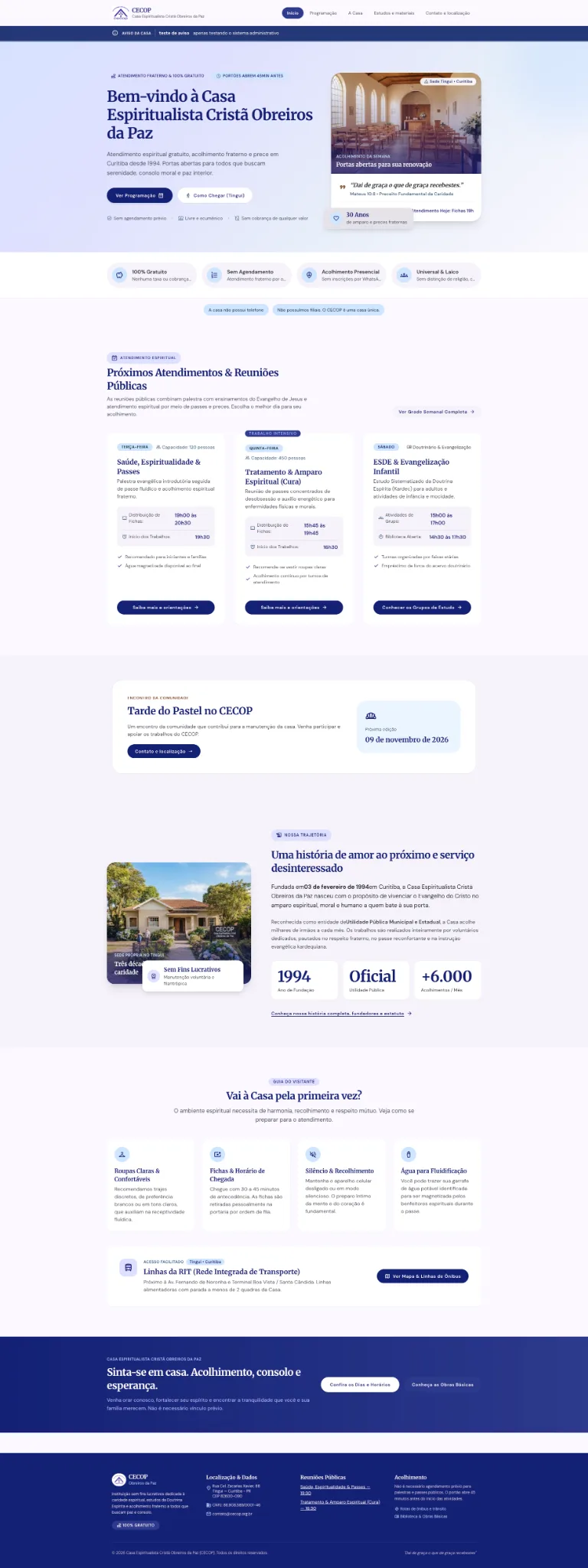
The redesign brings the welcome, free attendance and next actions into the entry experience.
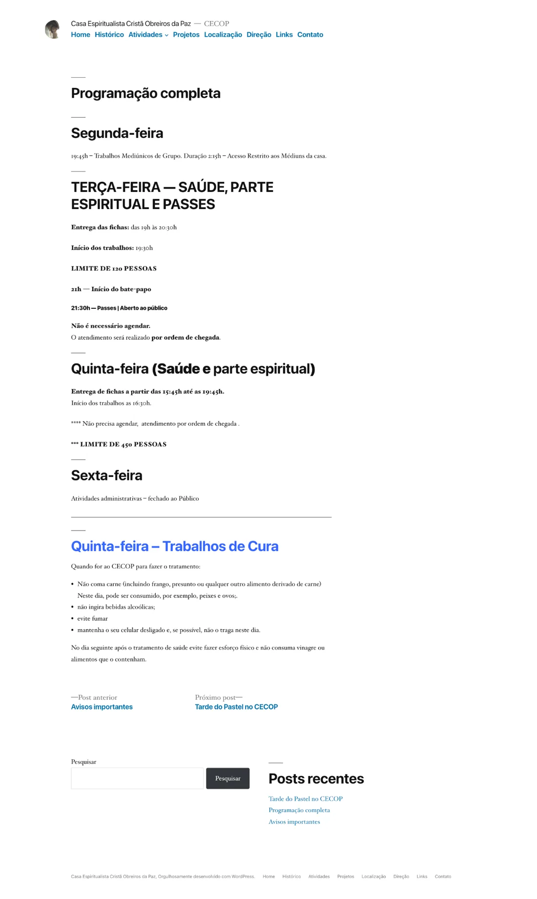
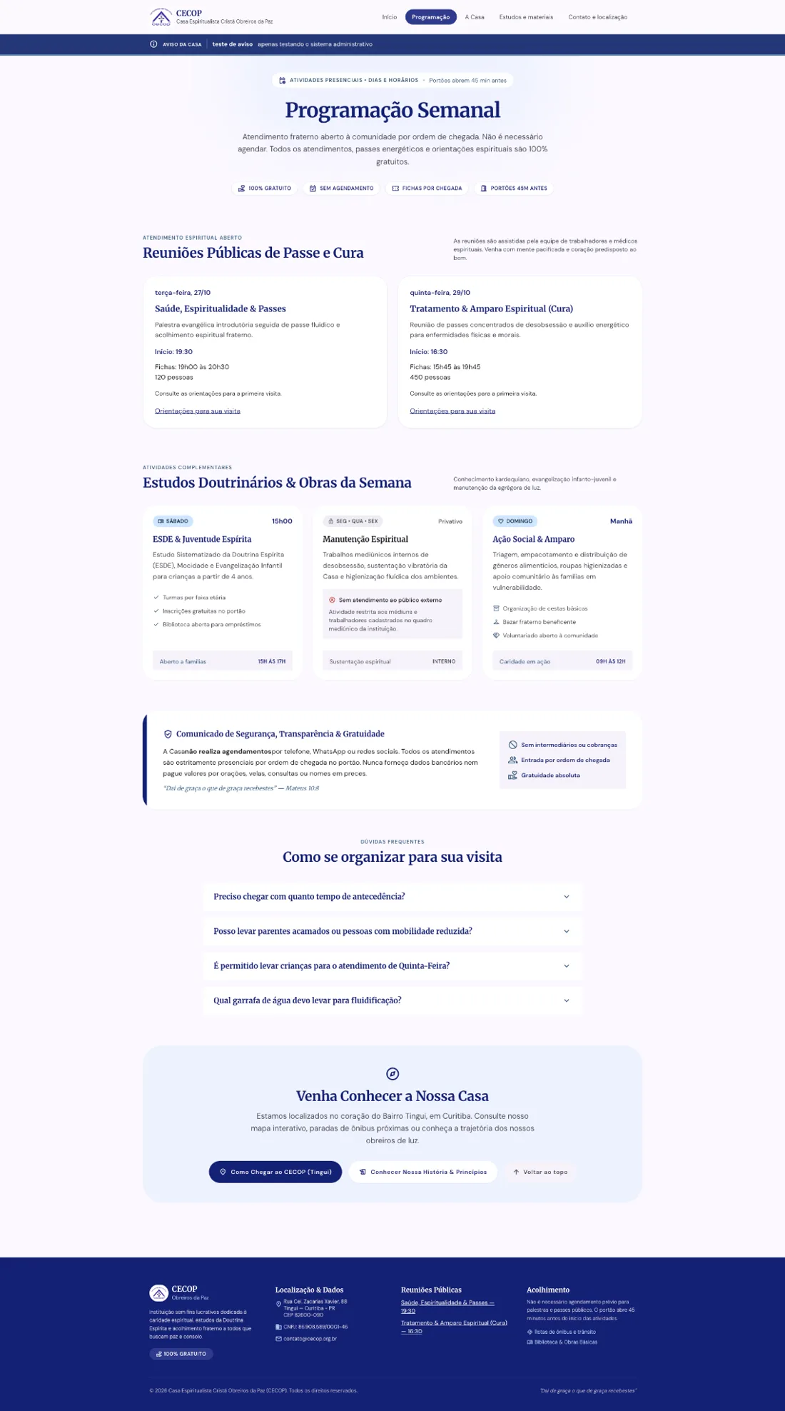
Schedules and preparation guidance are organized in a common reading structure.
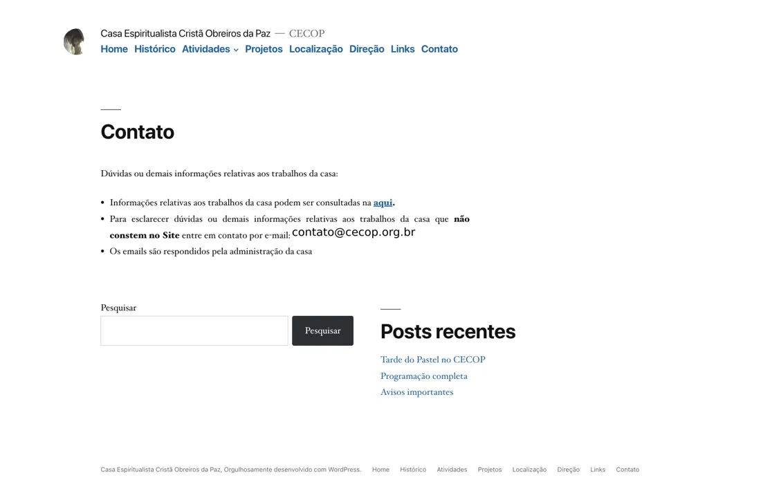
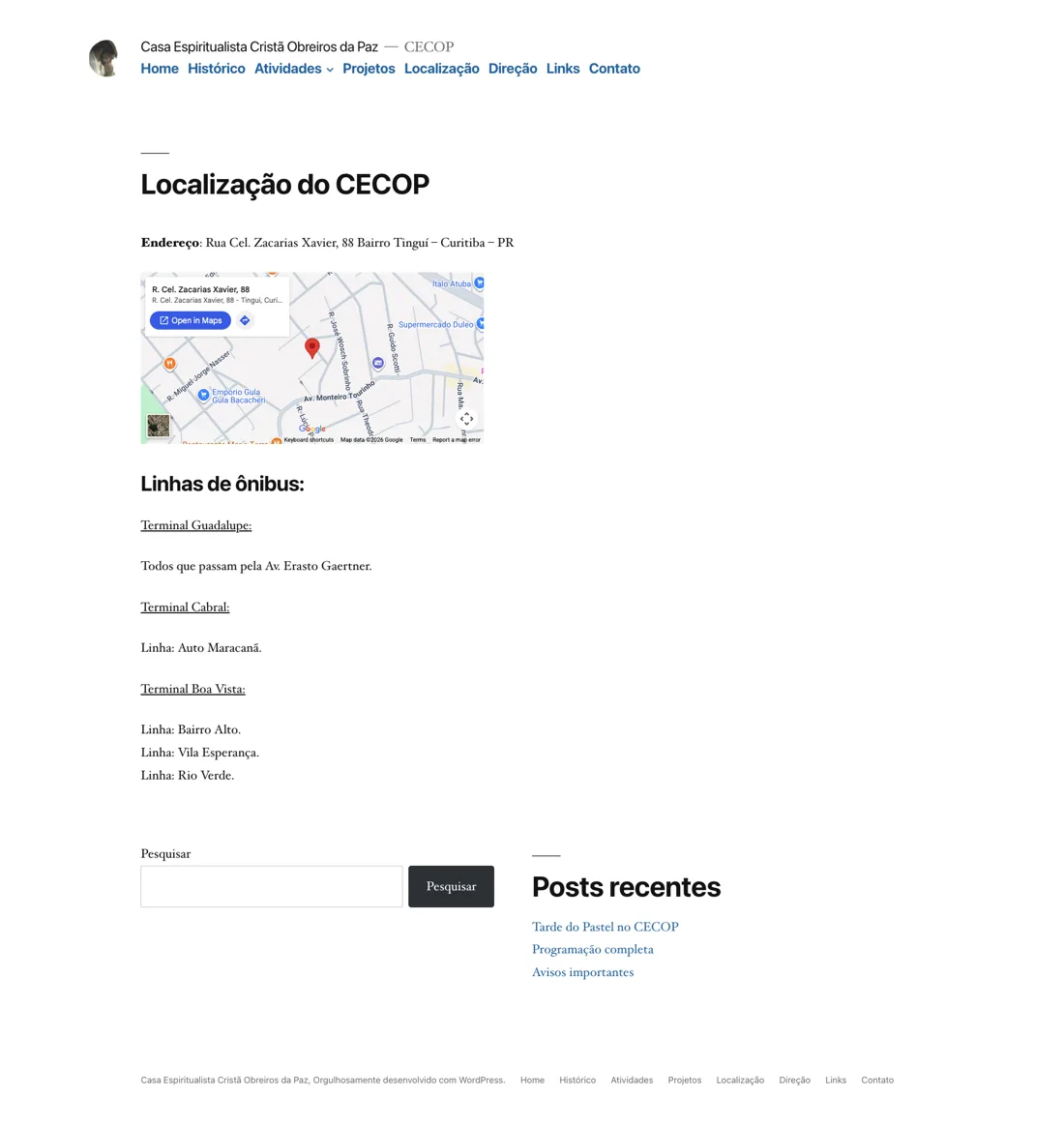
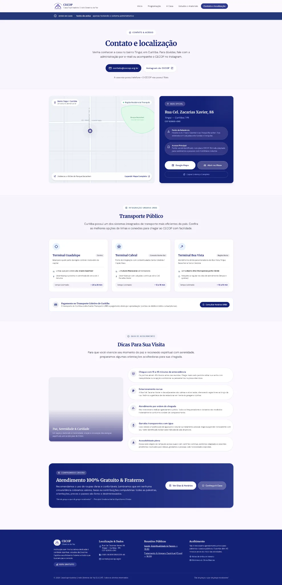
Desktop captures document the implementation before the final callout and badge refinements.
The responsive experience
The smaller-screen layout preserves the information sequence while reorganizing navigation, cards and actions. The supplied captures show the homepage, About page and expanded navigation at different viewport sizes.


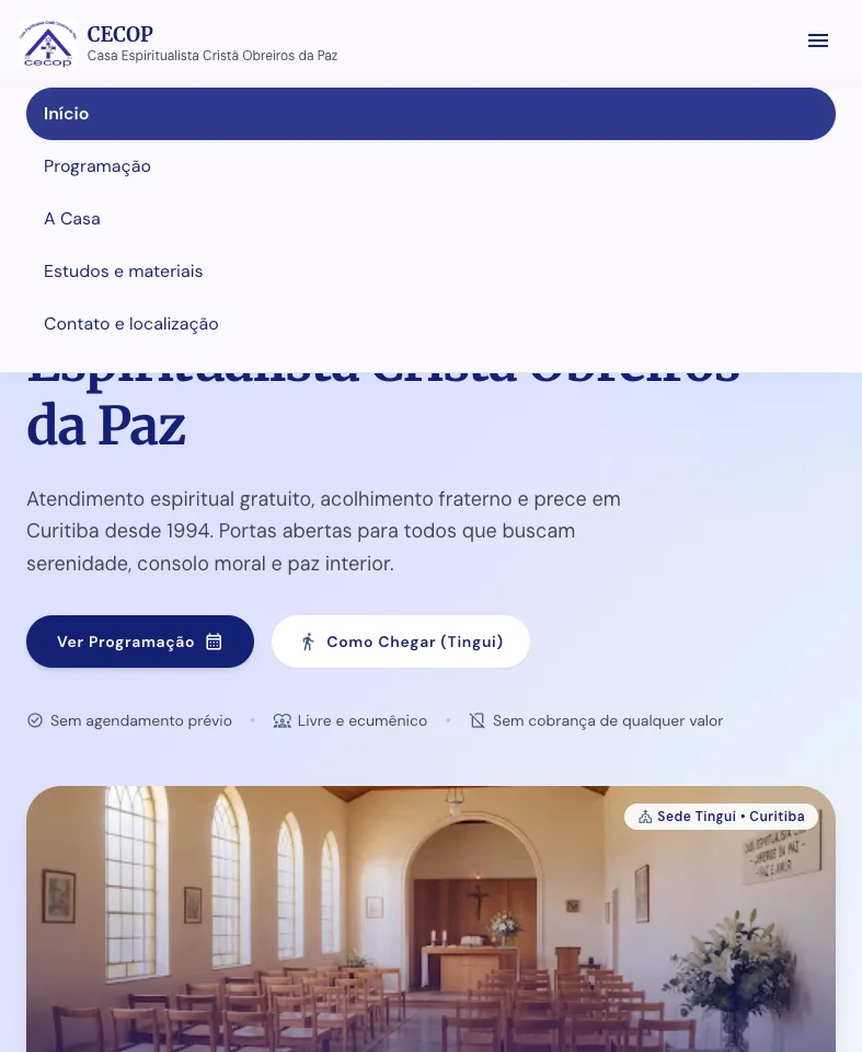
Reviewing the implementation revealed overlapping badges and compressed calls to action. Badges were moved below images, and final calls to action were standardized as responsive blue cards.
Autonomy beyond the interface
Decap CMS provides structured collections for schedules, notices, study materials and page content. Publishing creates a GitHub commit and triggers a Cloudflare build of the Astro site.
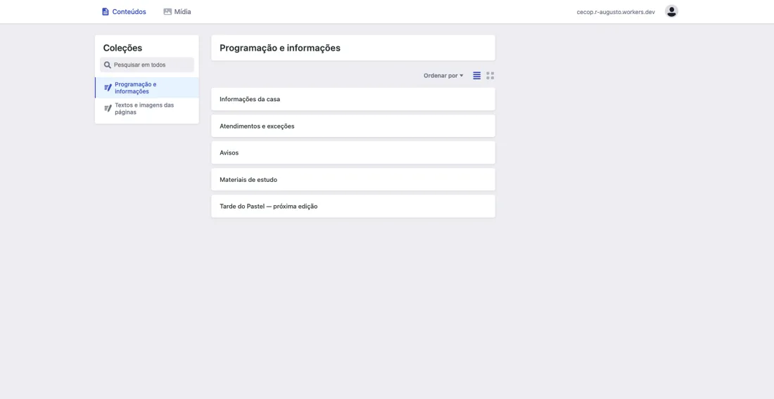
The end-to-end flow was verified by publishing a notice and confirming its appearance on the website. Editing speed and usability with volunteers have not yet been measured.
AI-assisted, designer-directed
Stitch supported interface exploration; Codex supported implementation and review. I selected the direction, reviewed content and compared the build with the chosen screens, refining inconsistencies through short feedback cycles.
Content decision
Consolidate contact and location while preserving useful books and event information.
Interface decision
Turn an oversized notice into a compact, clearly identified announcement strip.
These examples describe decisions made during the project; they are not reconstructed quotations of prompts.
Delivered, verified, still to learn
- Five primary pages and a responsive implementation.
- Study materials preserved and CMS connected to deployment.
- Notice publication verified in staging.
The official domain still serves the previous website. Next steps are institutional content review, visitor and editor task testing, accessibility and performance evaluation, and a decision on domain migration. No reduction in questions or increase in usability is claimed without measurement.
Explore staging ↗