
Designing the journey before the road begins
RotaOverland brings planning, vehicle readiness and on-road decisions into one connected experience for overland travelers.
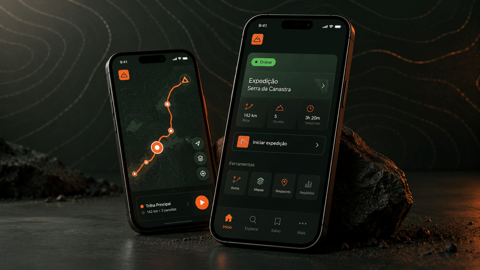
Context
An overland trip begins long before the engine starts. Routes, dates, companions, vehicle checks, offline maps and shared expenses are usually spread across different apps, messages and notes.
RotaOverland was conceived as a single place to create and manage an expedition from the first idea to the final record — without losing the independence and spontaneity that define this kind of travel.
The Challenge
The challenge was not simply to add another navigation app. It was to connect preparation and life on the road in a trustworthy experience — including the moments when connectivity disappears and attention must stay on driving.
How might we help travelers feel prepared, connected and in control throughout an entire expedition?
People & Journey
Two behavioral profiles guided the concept. Their needs overlap, but the level of control and collaboration they expect is different:
- The expedition leader organizes the route, vehicle, participants and shared decisions
- The participant needs quick access to the plan, convoy status, alerts and expenses
- Before the trip, both need confidence that people, vehicle and maps are ready
- On the road, both need low-attention interactions and reliable offline behavior
From insight to product
a.The expedition lifecycle
The journey was mapped as a lifecycle: discover, create, plan, prepare, travel, finish and remember. This revealed that “trip” should be the product's central object — not just a feature inside a map.
Descobrir
Transformar uma vontade em destino.
Planejar
Rota, datas e participantes.
Preparar
Veículo, checklist e offline.
Viajar
Navegar, alertar e registrar.
Recordar
Resumo e histórico da expedição.
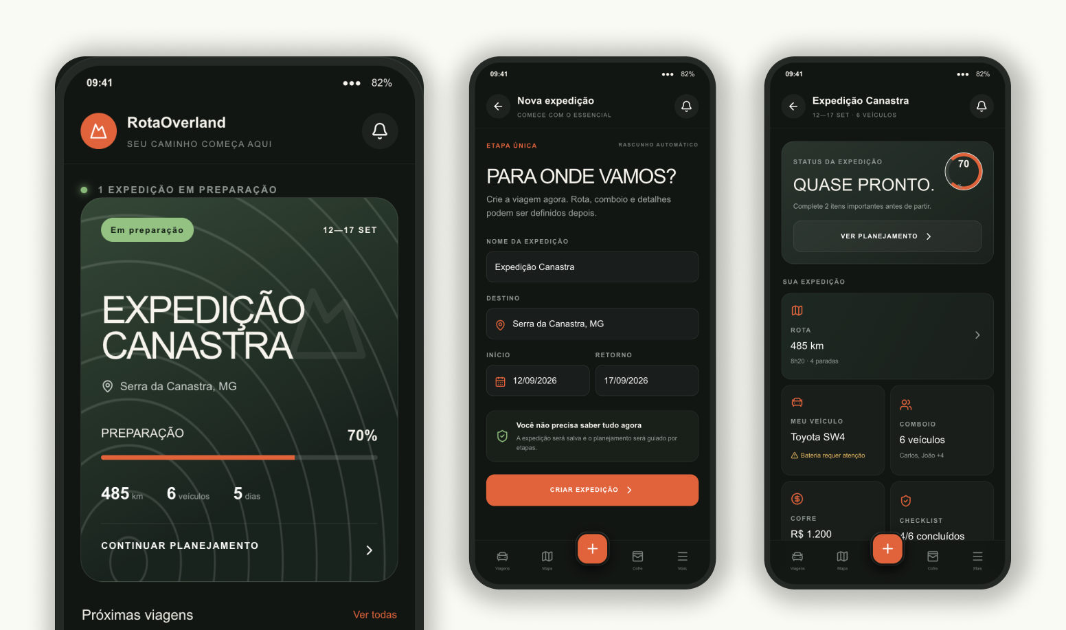
b.A trip-centered architecture
“My Trips” became the home. Each expedition gained a cockpit connecting route, convoy, vehicle, checklist, alerts and finances, making its status understandable at a glance.
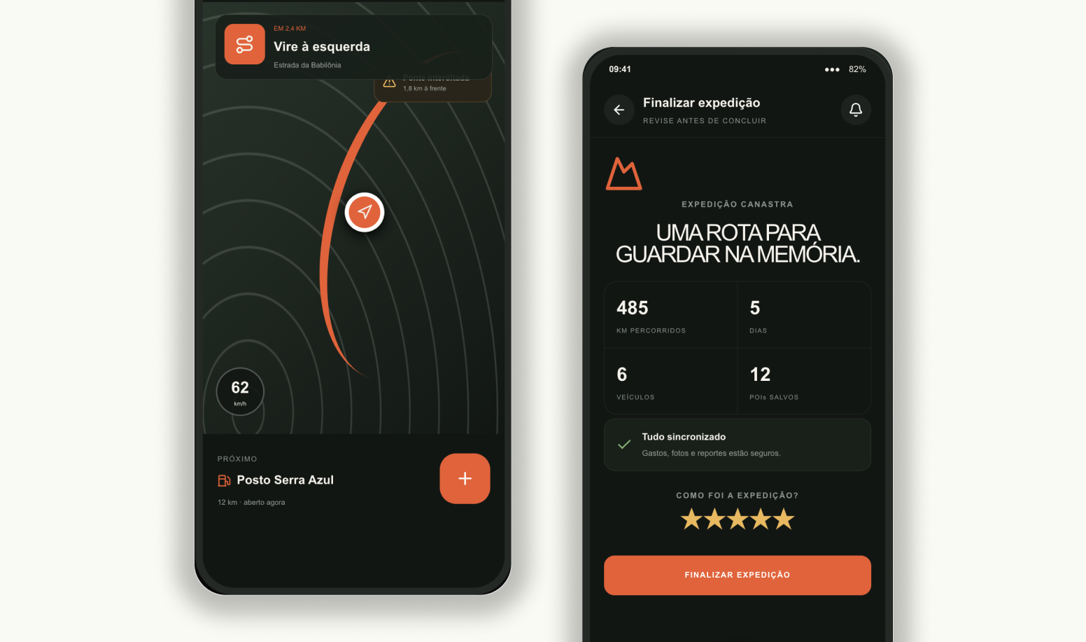
c.Critical flows first
The navigable prototype focused on the core loop: create an expedition, complete preparation and enter Travel Mode. Reporting an occurrence and logging an expense were reduced to short, contextual actions.
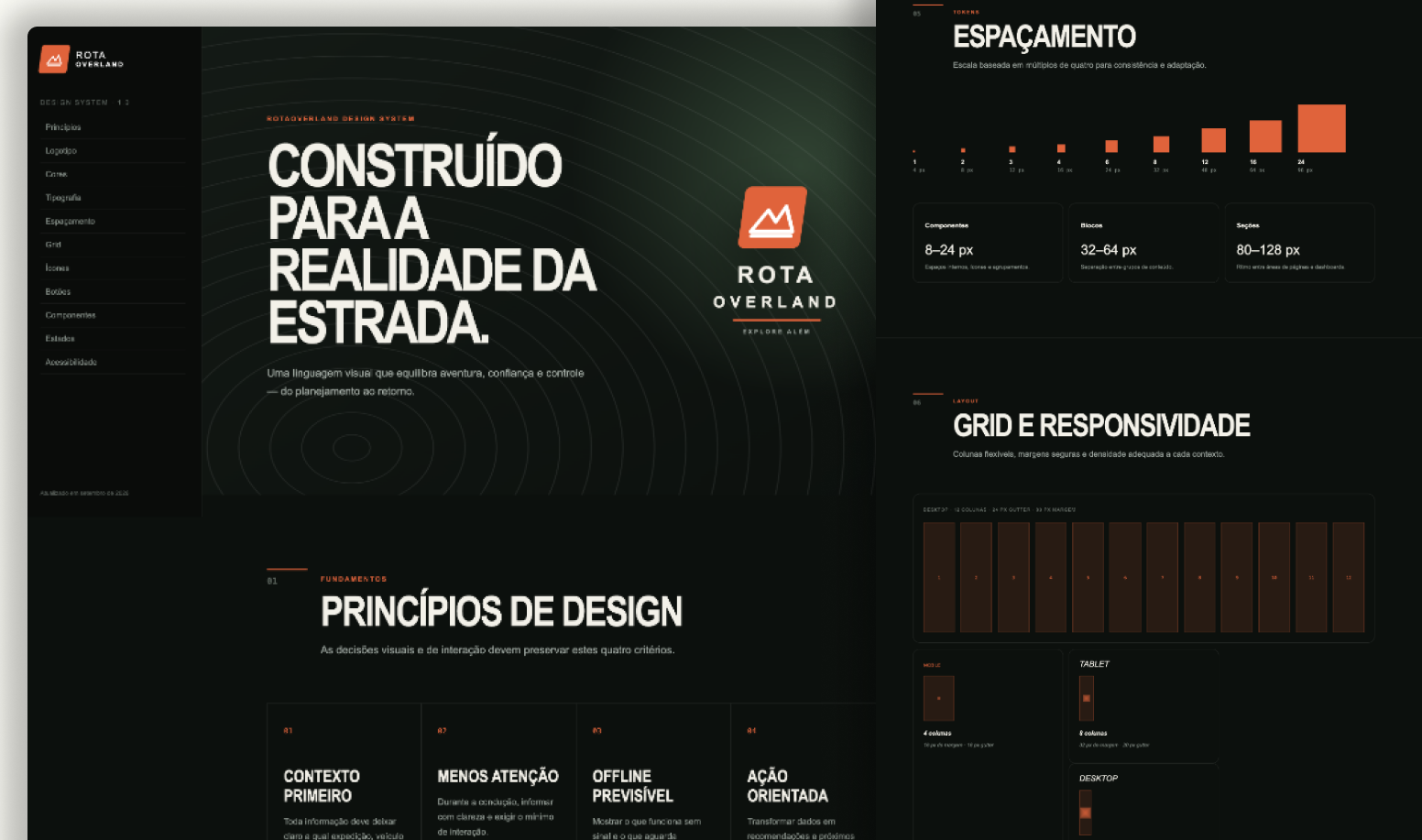
d.A language built for the road
The design system translated the brand into reusable foundations: high-contrast colors, clear status semantics, generous touch targets, a protected FAB and patterns for online, offline and syncing states.
Taking the story to market
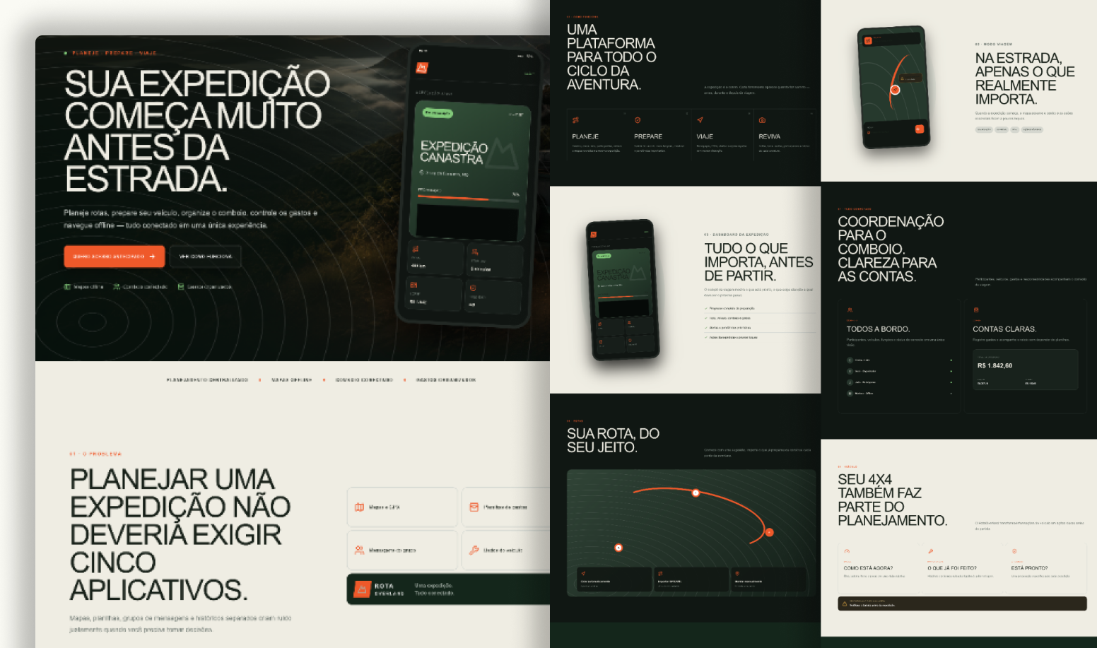
Once the product narrative was clear, the same principles were translated into a landing page. Instead of presenting a list of features, the page follows the traveler’s story — from planning with confidence to staying connected on the road.
Outcome & Impact
The result is a cohesive product concept and navigable prototype that turns a fragmented planning process into one continuous expedition story.
Trip management established as the product's central experience
Planning, vehicle, convoy and expenses connected in one context
Dedicated Travel Mode designed for speed, focus and offline confidence
Reusable design system and brand foundation ready to evolve
Learnings
The strongest decision was to design the experience around a lifecycle, not a feature list. When the expedition became the organizing principle, every supporting capability found a clearer place — and the interface could change priorities as the traveler moved from planning to driving.